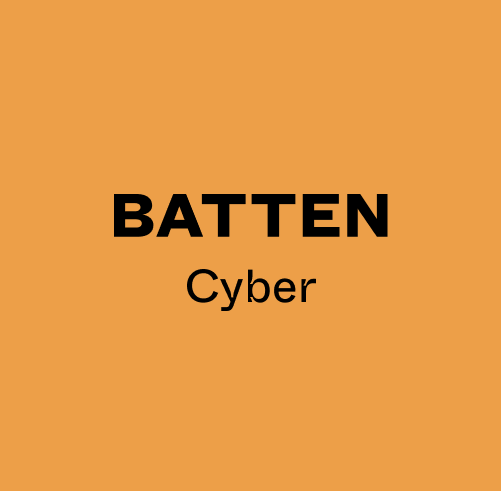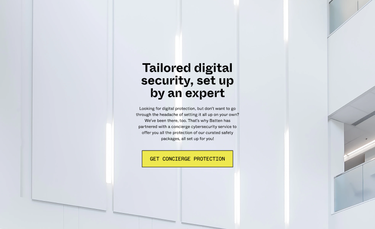
Batten Cyber
In an era where so much information is at our fingertips, it can be daunting to search for things like security solutions—a single click and Google might provide millions of results. Batten is a concierge service seeking to aggregate the best of the best solutions so that the average consumer wouldn't have to weed through advertisement after advertisement on their own, with no knowledge of what would work best for their own specific needs.
Batten came to me with its own brand book, created by the talented agency
Figure—which meant that instead of developing my own guidelines, I had to work to
project the meaning cultivated in theirs. Batten's name reflects its values: that it takes a proactive stance on protection, that it cultivates strength, and that it is a bastion of safety. This confidence permeates its branding as well, and is a formative part of its aesthetic.
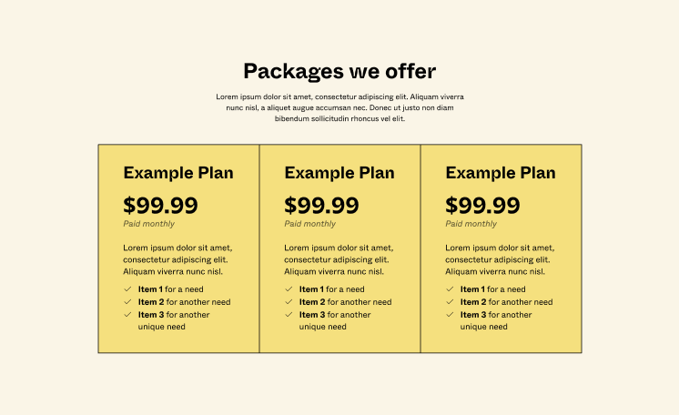
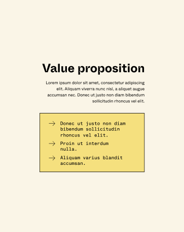
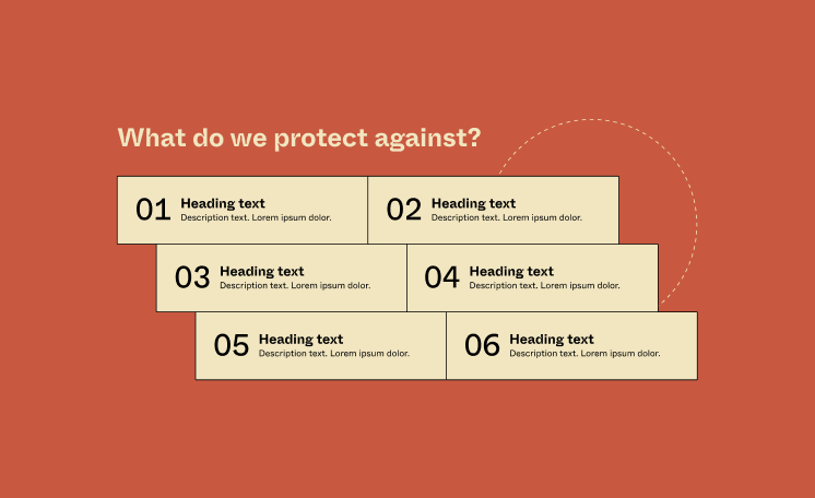
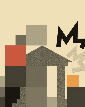
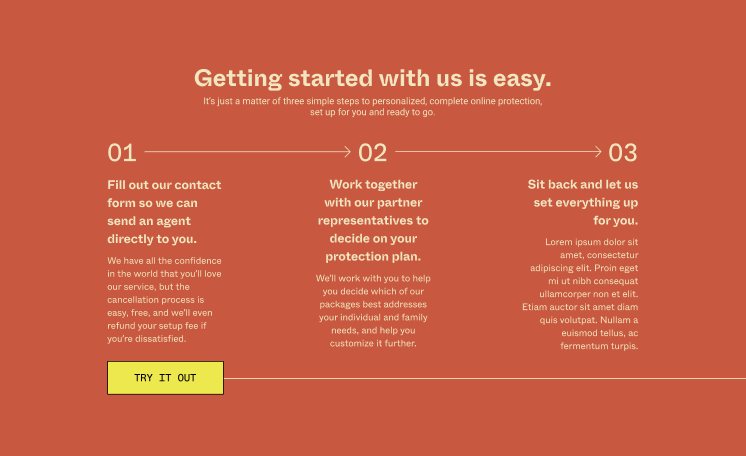
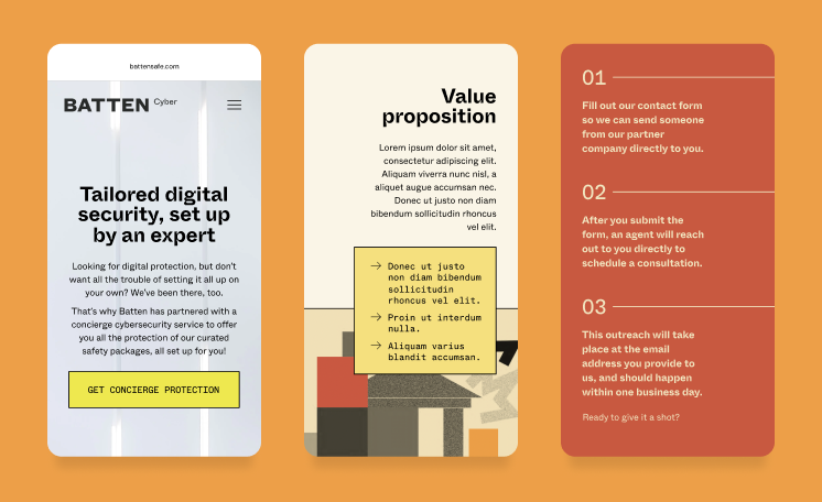
For Batten, I worked with strong, warm, solid color blocks, each outlined with a stroke so as to promote stability, legibility, and predictability. The geometric form factor of many aspects of this home page meant that there was an effective, simple way to cordon off information and build a textual hierarchy. It borrows from vintage inspirations, what with its containers and monospaced accent font, but provides enough visual innovation to also be something new, refreshing, and reliable.

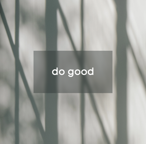
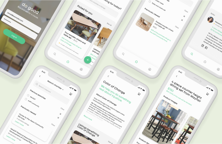
do good
do good, the brainchild of a product design class, began with an observation: so often, we see perfectly serviceable furniture thrown out curbside, despite the fact that furniture has the unique ability among pre-owned items to be relatively easily refreshed, up-cycled, or re-used as is. In fact, 9.8 million tons of furniture waste is generated annually in the United States, accounting for 4.1% of household waste. But why?
We came to realize that furniture wasn't being discarded for purely nonsensical reasons: often, renters move house, students move off of campus, families upsize or downsize—and there's not always a good way to take furniture with you, especially not on short notice. Thinking ahead to our own impending moves out of the dorms, we began considering ways that we could solve this problem, and why the existing solutions often weren't good enough to address the base problem. In the process, we had to address several obstacles: that people weren't handing off items because they didn't have the network to do so; that people were less likely to list items on e-commerce sites without an external motivator, given the amount of effort that making listings entails; and that buying online from individuals is always daunting because of a potential lack of trust.
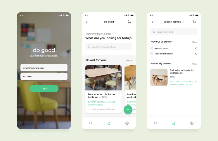
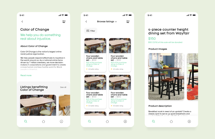
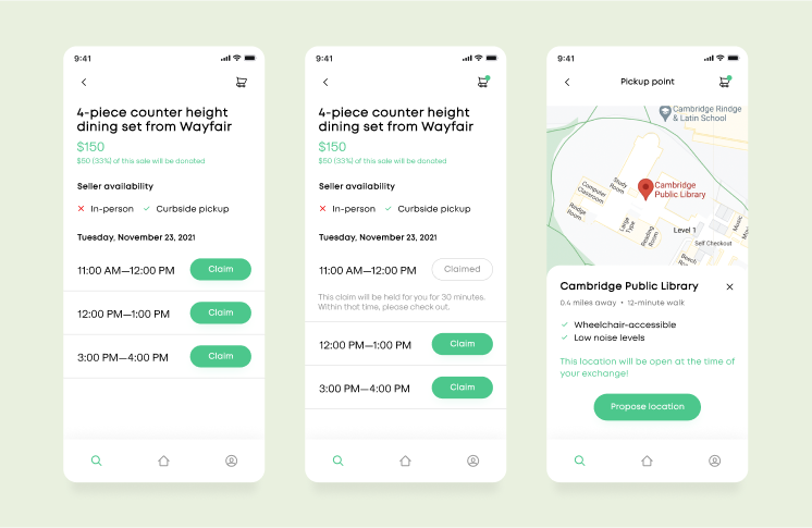
Finally, we created do good. do good motivates the user to contribute to the reuse of furniture by promising both a financial and charitable incentive, and simplifies the selling, buying, and pickup processes so that users can quickly do all three without worrying for their own safety or time investment. Inspiration for the app's brand comes from analysis of popular e-commerce applications like Shopify, Etsy, and eBay; the simple color palette was chosen for clarity and cleanliness, to emphasize the images of the products that the function of the application hinges upon. The round sans-serif fonts cultivate a simple, modern image, as do the rounded, shaded sections delineating the portions of each screen. Offset image containers indicate the application's mobility, inviting the user to explore through swiping, and offering a sleek, unobtrusive way to navigate the application.
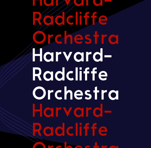
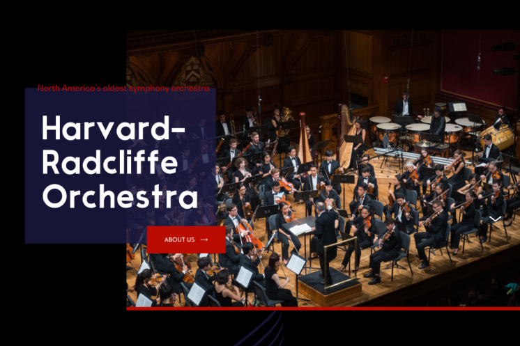
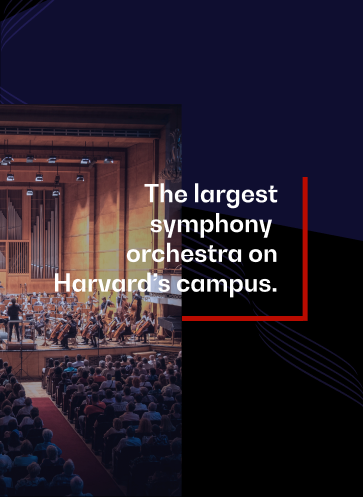
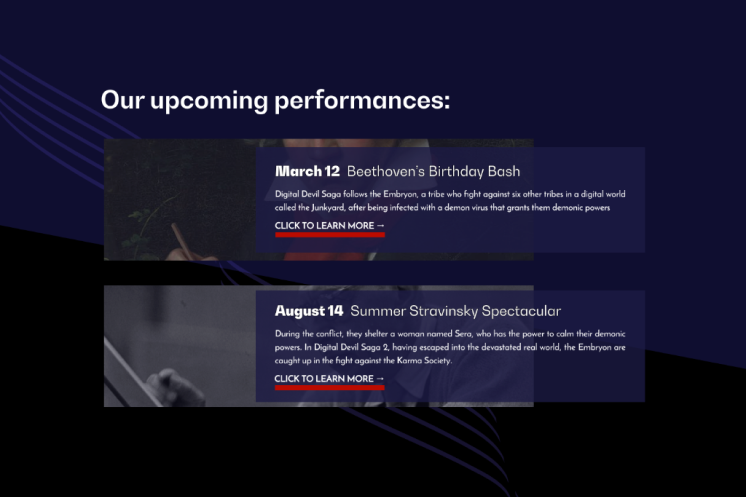
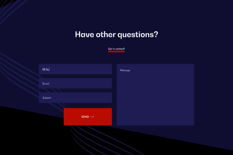
Harvard-Radcliffe Orchestra
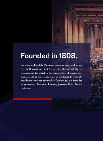
Founded in 1808, the Harvard-Radcliffe Orchestra is Harvard University's—and North America's—oldest symphony orchestra. However, in an age of increased diversity and bearing a need to welcome new audiences and members alike, the Orchestra desired to cultivate an aesthetic and reputation of approachability. Board members wanted members of minority groups not to feel put-off by the overbearing tradition of the Orchestra's history, but to feel represented, included, and welcomed. To that end, they sought a redesign of the Harvard-Radcliffe Orchestra's central website with a focus on more modern and playful shapes, colors, and terminology, while still retaining the respectability that comes with being one of Harvard's longest-standing establishments.
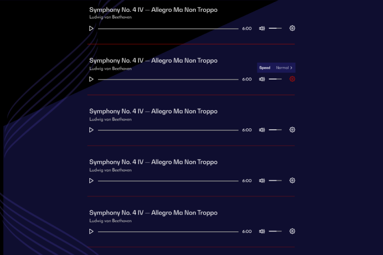
I developed a brand style heavily involving the use of overlapping, semi-opaque assets in the background to enhance the depth of the site; muted colors to preserve the previous site's sobriety, and only one bright red to draw the eye to calls to action; and layered, offset layouts to provide visual intrigue while maintaining the site's readability. The result is a beautifully modern, ever-so-slightly edgy brand, approachable enough to welcome newcomers and serious enough to live up to the Orchestra's storied history.
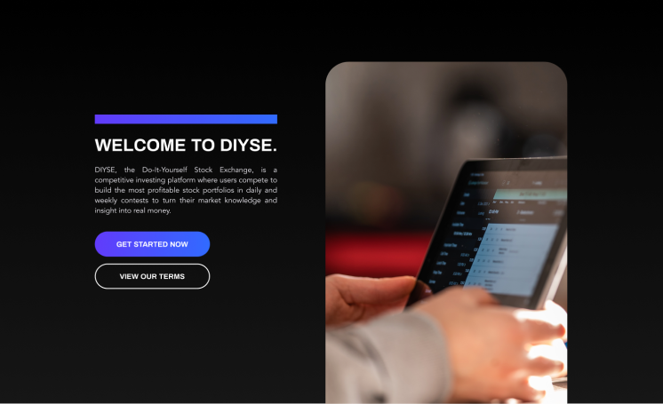
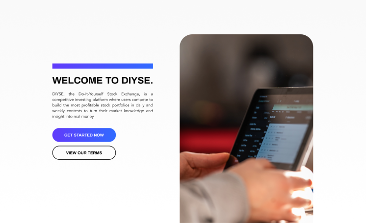
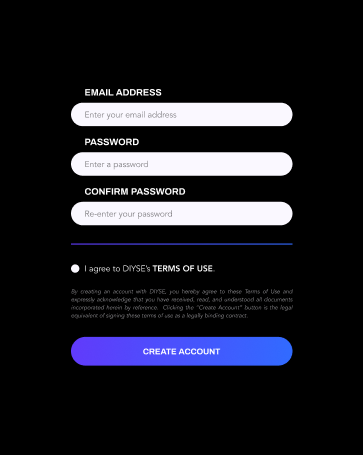
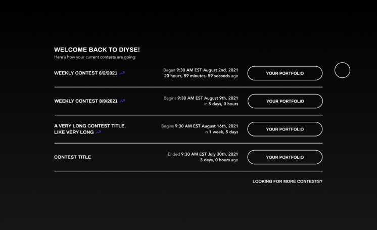
DIYSE
In 2021, the stock market was not the domain of the public. Recently, “meme” stocks and cryptocurrency have brought it closer to being so, but even just a few years ago, it was largely seen as an exclusive club in which only the wealthiest of Wall Street could participate. DIYSE, or the Do-It-Yourself Stock Exchange, wanted to change that perception and bring stock trading to general audiences.
First and foremost, we sought to create a welcoming environment by playing into gamification. Given the popularity of sites like DraftKings, where the entry barrier is low and the betting more of a game than a high-stakes gamble, there was a chance that by emulating that approach we could familiarize formerly distant concepts like stock exchange to our audience. That said, since the stock market is necessarily more of a sober area, and because it’s rife with regulations, we couldn’t take our gamification approach too far—we had to preserve an aspect of stoicism.
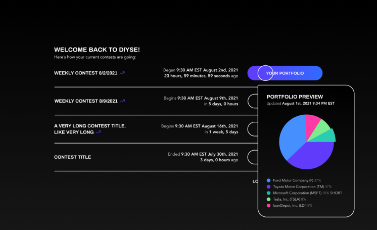
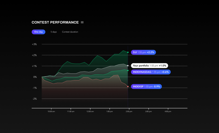
Ultimately, I presented a dual light- and dark-theme brand book making use of vivid blues and purples for accents. Bold strokes, attenuated by rounded corners and buttons, divide information clearly but retain an almost-futuristic effect. The simplicity of the brand, which avoids using images save for in high-impact locations, allows users to navigate without being overwhelmed by visuals or distracted from key moments.

All In
The art of play is something ingrained in human nature. From the very earliest days of civilization, we were playing: artifacts abound indicating the presence of toys and trinkets even before the start of recorded history. Archaeologists have reconstructed games from Mesopotamia and Egypt, played more than three thousand years ago. Play is essential to the human spirit; it is often how we connect with other people, learn and practice socializing, and buoy the spirit.
In the modern day, in the United States, an estimated 50 to 60 million people play poker; this represents fifteen percent or more of the entire country's population, making it a wildly popular game. In spite of this, there is one demographic for whom play is unduly difficult: the visually-impaired and blind. Through research, we learned that blind poker players on the professional circuit utilize "readers," people that they take into play areas with them who are able to relay information about the player's hand and the shared state, or the cards being placed in the middle of the table. However, these players sometimes face issues with bringing their readers in with them—institutions that host games frequently have concerns about cheating—and players without readers often have no recourse.
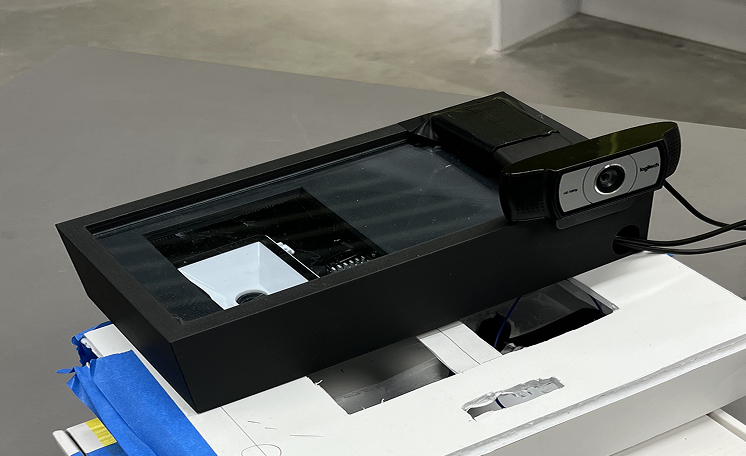
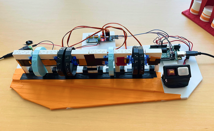
We wanted to empower visually-impaired and blind poker players to play on their own, without needing to rely on external help. To do so, we created a system of gameplay components: a shared state console, an individual console, and a set of accessible accessories.

The shared state console is placed next to the dealer, and as the flop, turn, and river are placed in the middle of the table, each card is scanned on the camera attached to the console. The player's two hand cards are scanned as well.

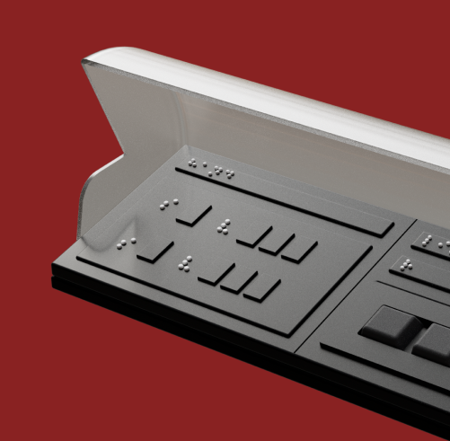
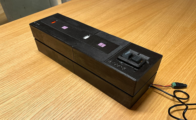
The individual console is kept with the visually-impaired or blind player, and contains cells from which they can read the values of their own cards and hear the values of the shared state cards read to them.
The individual console consists of an arrangement of servos that rotate wheels containing different card values; the first set of two Braille cells displays the suit and value of the player's first card, and the second set of two cells displays the same for the second card. On the right side of the console is an audio player that narrates the values of the shared or hand cards.
These two consoles work in conjunction to read in information from the middle of the table and display it for the visually-impaired player. To develop the individual console, we conducted multiple interviews with visually-impaired and blind audiences, and also solicited feedback while tabling at the Technology Fair held by the Carroll Institute of the Blind; from these, we determined the optimal size of the Braille cells, the ideal coloring of the console, and the necessity of including an audio option.
The consoles connect to one another in the following way:

The consoles are placed on different parts of the table, but connected via (in our demonstrations) a computer, acting as a processor.

The two hand cards are scanned by the dealer on the flatbed scanner of the shared state console. As the shared cards (the flop, turn, and river) are dealt, they are also scanned in via the other camera mounted on the console.

The camera captures are fed into the computer, where the values of each card are recognized and stored in code.

Finally, based on the stored card value information, the servo motors rotate to display the correct card value. Players can then read the Braille cells or listen to the text-to-speech element to determine the values of their hand cards, or listen to the text-to-speech element read the values of the shared cards.
Finally, we determined an ideal look and feel for the individual console; this console was the most important to us, as it was the console that the player would be interacting with the most. In designing the "commercial" version of the individual console, we consulted our interviewees on the assistive Braille devices they regularly used; we determined what worked well and what didn't work well, and incorporated characteristics that mimicked familiar devices so the learning curve wouldn't be so steep. We also accounted for ergonomics and ease of transportation.
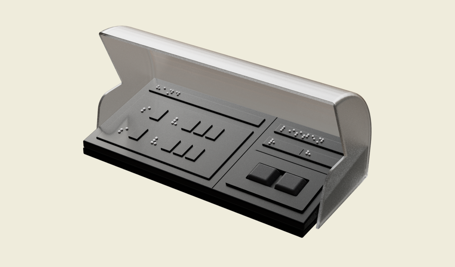
The final mock-up of an "ideal" commercial state for the individual console.
The final console features the same Braille and audio components, but provides space to display the Nemeth code numerical indicator next to any number values; it also provides two cells to each number display to accommodate the number 10. It is a comfortable size both to transport and to rest one's hand on, and a slight slope helps to maintain the line of the wrist so that it does not have to flex when the user is reading.
This project was presented for assessment at the end of the first semester of Harvard Graduate School of Design and School of Engineering and Applied Sciences' Master in Design Engineering program, where it was evaluated favorably and received valuable feedback.
This project was developed in a group for Harvard's Master in Design Engineering program.
Hardware for this project was built by Jules Ramos; software was developed by Andrew Gorovoy; fabrication (including of 3D models) was done by Kelisi; design, final 3D model, and presentation assets were created by Eli Su. Thank you to all who participated in work for this project.
Thank you to our expert resources for providing valuable insights; thank you to our user group interviewees for helping us to design with them, without which this project could not have been completed.